Top 9 Web Design Trends for 2023
1. Experimental Navigation
When we talk about experimental navigation,
we mean the patterns that deviate from the standard (top-of-the-screen
navigation in all caps with a sans serif font). Experimental patterns, on the other
hand, use a more imaginative approach, creating visual interest and directing
people to utilize the website in a particular way.
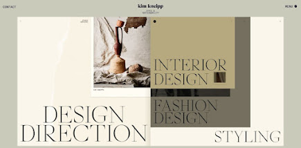
Consider the portfolio website for Kim
Kneipp's. A menu that resembles a book's table of
contents slides in from the bottom of the screen when you click the Menu button
in the top right corner of the homepage. In order to propose a reading order,
each page is numbered. Your screen's right side has a list of projects that are
numbered and arranged by category and colour.
What we like: Thanks to experimental
navigation, you're encouraged to make your website's navigation an extension of
its unique branding in 2023.
2. Scrolling Effects
Scrolling Effects make online experiences
more dynamic, scrolling effects—animations started by scrolling—are perhaps one
of the most well-liked and in-vogue web design components this year. These are
being utilized more frequently on interactive websites to entice users to
scroll down, indicate a content break, and provide a three-dimensional
experience.
By mixing horizontal and vertical scrolling
with other effects, Engineered Floors does
precisely that. On the right of the webpage, the user may see what looks to be
a picture of a chair. This picture zooms out as the viewer scrolls to display a
living room that is eventually carpeted. This 3D experience is entertaining and
educational.
What we like: Scrolling effects can entice
viewers and persuade them to scroll even further down.
3. Structured Typography
Structured typography is being used to
headline the home pages of an increasing number of businesses. Consumers need
stability and structure in a post-pandemic society, and structured typography
is suggestive of both. (Consider all-capital letters and forms that are
substantial.)
An good illustration of how organized
typography may seem on your website can be seen here. The Aww
wards webpage demonstrates the impact that
organized typefaces may have.
What we like: Structured typography clearly
communicates to visitors' eyes where they should be looking.
4. cinemographs
Cinemographs are only one example of the
motion-based web design ideas that will dominate in 2023. A Cinemograph is
what?
Cinemographs are static images that have a
repetitive movement that creates the illusion of a brief video clip. They are
often distributed in the GIF or MP4 format, making it simple to embed them in
online articles and social media.
In the past, full-screen loops have been more
common, but this year, you'll find tiny animations dotted throughout intricate
patterns. As in this illustration from the design and technology company Grafik, the
inclusion of these cinemographs’ pulls the eye and encourages your readers to
scroll.
What we like: Even if your website is long,
cinemagraphs can ensure that visitors view the full thing.
5. Animated Illustrations
As one of the newest trends in web design,
more businesses are hiring illustrators and graphic designers to produce custom
graphics for their websites. Illustration effectively conveys more complicated
themes that lifestyle photography may not always be able to do.
To enhance interaction, these drawings are
frequently animated. For instance, the images on the NewActon
website (created by the Australian digital agency ED) will jiggle when you move
your cursor over them. Only the image you are now hovering over will then keep
moving in a little circle. Each graphic in this design reflects a different
category from the navigation menu to the right, making it utilitarian as well.
What we like: Animated drawings may be used
to simplify complicated concepts and give a website some personality.
6. Overlapping Text and
Images
An increasingly common effect for blogs and
portfolios is text that just barely overlays the accompanying photographs. Thibault Pailloux, a
freelance front-end developer and creative designer, illustrates how by adding
overlapping text with a vivid underlining beneath each title.
What we like: Text and picture overlap
maximizes page space while enhancing aesthetic appeal.
7. Gamified Design
One of the most pervasive website design
ideas this year, gamified design is ubiquitous in 2023. Gamification is a great
idea since it gives users a more human experience. For instance, when consumers
visit your website, they engage with your material in a distinctive, memorable
way. This illustration provided by PrettyDamnQuick
exemplifies what we mean.
What we like: From the perspective of user
engagement, this whimsical trend is clever rather than just entertaining.
8. Emphasis on Product
Photography
The year when product photography rules
supreme for e-commerce websites will be 2023. Product photography will take centre
stage throughout industries in 2023, from cosmetics firms to apparel labels and
beyond. This illustration from the skincare company BYOMA
demonstrates the power of emphasizing your brand's goods.
What we like: Visitors are immediately
engaged in what you're offering when they land on your website; they don't need
to search for photographs of it.
9. Pastel Colours
Pastel colours are anticipated to rule
website design in 2023. Bright and cosy pastels are a refreshing
change from the gloomy of early 2020s. This Cédric
Pereira portfolio demonstrates how powerful
pastel
colours can be on the eye.
What we like: Your website gains lightness
through the use of pastels.


More options are in development.
ReplyDeleteThis is really useful article
ReplyDeleteAnimated Illustration is future 👌
ReplyDelete